Column
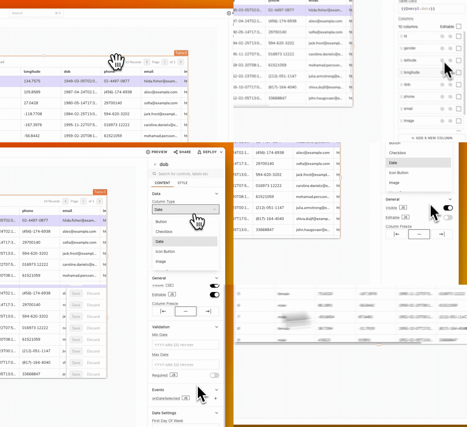
You can customize each table column separately by accessing properties through the gear icon ⚙️ in the table's properties pane. This includes editing existing column properties, adding new custom columns, rearranging columns, and hiding columns.

Computed value
In the Table widget, computed value is a column property that allows you to display and manipulate the table data using JavaScript expressions. To make use of this feature, you can use the currentRow property within the column settings.
The currentRow property is automatically generated by default in the Table widget when you add data to the table. For instance, the computed value of a column named dob that displays the date of birth for each row would be {{currentRow['dob']}}. Additionally, you can also create custom expressions that compute new values based on the data in the current row.
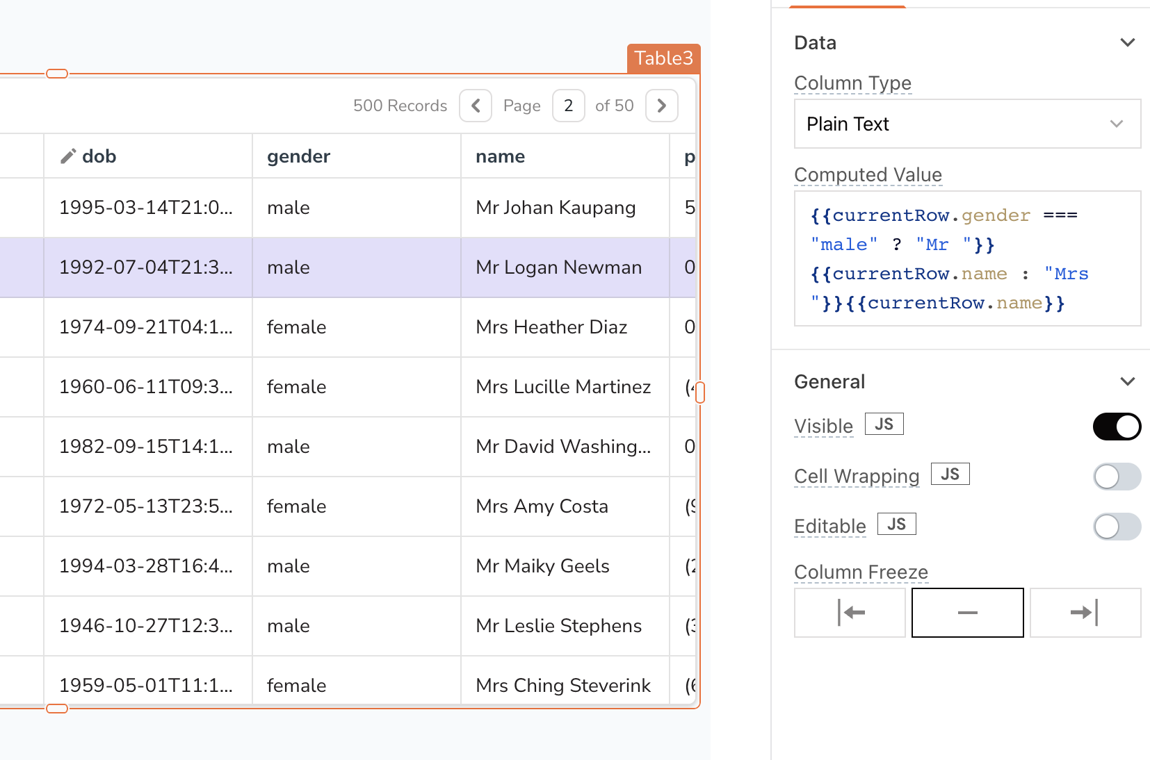
Example: suppose you have a table with a name column and a gender column. If you want to add a prefix of Mr. or Mrs. to the names in the name column based on the data in the gender column, you can use a computed value.
- Fetch data from the sample users database using a SELECT query
fetchDatato retrieve the data:
SELECT * FROM users ORDER BY id LIMIT 10;
- In the Table's Table Data property, display the data using:
{{fetchData.data}}
- Select the
namecolumn from the list of columns, and add following code in the Computed Value property:
{{currentRow.gender === "male" ? "Mr " + currentRow.name : "Mrs " + currentRow.name}}
The code uses a ternary operator to add a prefix of Mr. or Mrs. to the name column based on the value of the gender column in the current row.

Cell Background Color (Column Color)
You can style each column type from the style property pane, including options to change column color. However, if you need more advanced customization, such as changing table color/column color, you can use the currentRow and currentIndex references to create custom color expressions. These expressions enable you to conditionally change color and style of individual cells based on their content, offering more flexibility than simply applying a static style to an entire column.
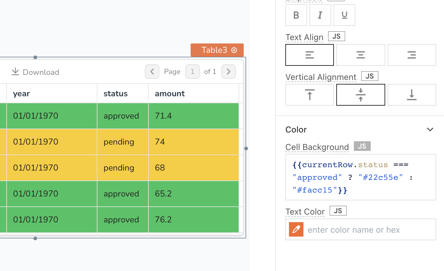
For example, lets say you have a column named status that reflects approved and pending values. You can set the color for these values using the following expression in the Cell Background property:
{{currentRow.status === "approved" ? "#22c55e" : "#facc15"}}
If you want to keep the same background color for an entire row, you can use the same custom style expression in each column Cell Background property.

Properties
These common properties allow you to edit the column, and customize the user actions.
| Property | Data type | Description |
|---|---|---|
| Column type | String | Sets the type of cell to use in this column. There are a variety of different types that have different behaviors, such as buttons, switches, and more. |
| Computed Value | String | It allows you to manipulate the value using JS expressions. |
| Visible | Boolean | Controls the column's visibility on the page. When turned off, the column won't be visible. |
| Disabled | Boolean | It disables input to the column type. The column type remains visible to the user, but user input is not allowed. |
| Column Freeze | Boolean | Controls whether to unfreeze or freeze the column to the left or right. |
| Editable | Boolean | A property that determines whether the user can modify a field or cell. Learn more about Inline editing. |
| Required | Boolean | Makes input to the column type mandatory. |
| Cell Wrapping | Boolean | Allow content of cell to be wrapped. |
| Text | String | Sets the label of the column type. |
| Date Format | String | The Date Format property specifies the date format of the incoming data specified in the Computed Value property. For example, if the incoming date is in the format YYYY-MM-DD HH:mm and the option selected in the Date Format property is DD/MM/YYYY, then it cannot parse the date and displays 'Invalid date' in the column. |
| Display Format | String | The Display Format property specifies how the date information should be displayed to the user. For example, if the incoming date is in the format YYYY-MM-DD but the Display Format property is set to DD/MM/YYYY, the date information would be displayed to the user in the desired format of DD/MM/YYYY. |
| Icon | String | Sets the icon to be used for the icon column type. |
| Menu Items Source | String | Sets source for menu column type. |
| Menu Items | List | Display list of menu items. |
| Source Data | Array | This property is used to specify the data source for a dynamic menu. |
| Configure Menu Items | Function | You define the styles for the menu items. |
| Add a New Menu Item | Function | This button adds a new item to the menu. |
| Compact | Boolean | This property decides if the column type is in compact mode. |
| Options | Array | Options to be shown on the select dropdown. |
| Placeholder | String | Sets the placeholder text within the input box. |
| Filterable | Boolean | It makes the dropdown list filterable. |
| Reset filter text on close | Boolean | Reset the filter text when the dropdown is closed. |
| Server Side Filtering | Boolean | Enables Server Side Filtering of the data. |
| Display Text | String | The text to be displayed in the column. |
Column types
This property allows you to select the type of cell to use in the column. Currently, the following column types are available:
| Column type | Description |
|---|---|
| Button | The button column type is a cell that can be clicked by the user, which triggers an onClick event and the triggeredRow reference property retrieves the data of the corresponding row. |
| Checkbox | The checkbox column type denotes a binary value, with the checked and unchecked states represented by True and False, respectively. This column type can be made editable by enabling the Editable property in the column settings. |
| Icon Button | The Icon button column type is a clickable button with an icon instead of text. It triggers an onClick event and the triggeredRow reference property retrieves the data of the corresponding row. |
| Image | The image column type displays an image by interpreting the cell value as an image source URL or base64 data. It shows Invalid Image if the data is not valid. |
| Menu Button | The menu button column type is a group of buttons that can be expanded into a menu. Menu items can be added dynamically using the Menu Items Source as Dynamic and the {{currentRow}} referencing inside the Source Data property. However, for configuring the menu items, only the {{currentItem}} and {{currentIndex}} can be used. |
| Number | The number column type is used for numeric data and supports inline editing. It can be made editable by enabling the Editable property in the column settings. |
| Plain Text | The plain text column type represents data with readable characters and supports inline editing. It can be made editable by enabling the Editable property in the column settings. |
| Switch | The Switch column type allows users to toggle a single item on or off, using binary values. It supports inline editing and can be made editable by enabling the Editable property in the column settings. |
| URL | The URL column type interprets the cell value as a hyperlink, allowing users to click on the cell and open the corresponding URL in a new browser tab. It requires including the domain and suffix of the URL, such as example.com. |
| Video | With the video column type, you can display videos within a table. To add a video to a cell, simply provide a source file path or URL from platforms such as YouTube, Facebook, Twitch, SoundCloud, Streamable, Vimeo, Wistia, Mixcloud, or DailyMotion as the cell value. |
| Date | The Date column type allows you to set up custom formatting options for date and time information. You can format and display the date using the Date Format and Display Format properties. It supports inline editing. |
| Select | The Select column type allows users to select an option from a predefined list of choices. The Options property should be an array of objects, with each object containing a label and a value property, [{ "label": "ABC", "value": "abc"}] . The select column type can only be displayed or edited when the Editable property is enabled in the column settings. |
Style properties
Style properties allow you to change the look and feel of the column type.
| Property | Data Type | Description |
|---|---|---|
| Text Size | String | Sets the size of the text in the column. |
| Emphasis | String | Toggles bold or italic emphasis on the text. |
| Text Align | String | Sets the horizontal alignment of the text. |
| Border Radius | String | Allows you to define curved corners. |
| Box Shadow | String | Applies a shadow effect to the cells in the column. |
| Button Variant | String | Sets the visual style for buttons in the column. |
| Button Color | String | Sets the background color for buttons in the column. |
| Cell Background | String | Sets the background color for the cells in the column. |
| Horizontal Alignment | String | Sets the horizontal alignment of content within cells. |
| Vertical Alignment | String | Sets the vertical alignment of content within cells. |
| Text Color | String | Sets the color for the text in the column. |
| Image Size | Options | Allows you to resize an image for Image column type. |
| Position | Options | Sets the position of the cell. |
| Icon | String | Displays an icon within the cell. |